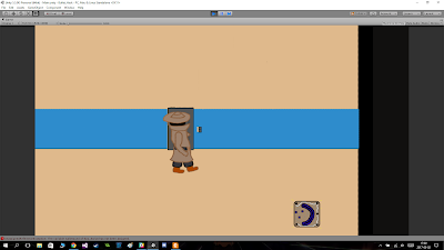
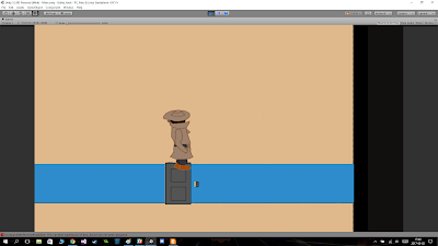
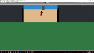
During a majority of the development cyckle we designed our game with the split screen in mind. Everything from the sprite sizes, level design and even the amount of health the player would have was a by-product of the split screen. The longer in in the development we got we started to doubt the split screen on several levels. We doubted how the game played, we doubted how it looked aesthetically and we doubted the the sizes of the sprites. So almost everything in the game we doubted because of the split screen.
It all came to a head during the beta playtesting session where one of the most consisten critiscisms we recieved were about the split screen and how ugly it made the game look.
After the playtest we were worried the game would never be any better because we were stuck with the split screen because it was so prominent in the concept document. Fortunaley we asked Marcus about it and he said we could remove it eithout any problem. So we decided to remove it and see if the games quality improved, and to our delight it did.
With the split screen gone we could finally improve our game to a point where the doubts we had wasn't centered around the damned screens. Now our doubts is about how well the art looks and how it conveys the mood we aim to set in our game (the same can be said about the gameplay).


